Select menus
Select menus are dropdown components. An action row can hold exactly one select menu. Arcscord supports all five Discord select menu types.
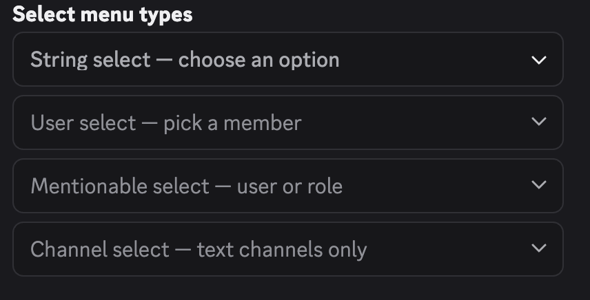
What they look like
All select menu builder functions (stringSelectMenu, userSelectMenu, etc.) already return an ActionRowData — they wrap the component in an action row automatically. Pass the result directly to components: [...] without wrapping in actionRow().
Common options
These options apply to all select menu types.
| Option | Type | Required | Description |
|---|---|---|---|
customId | string | Yes | Must be set to id(). Max 100 chars. |
placeholder | string | No | Grey text shown when nothing is selected. Max 150 chars. |
minValues | number | No | Minimum number of selections required. Default: 1. |
maxValues | number | No | Maximum number of selections allowed. Default: 1. |
disabled | boolean | No | Prevents interaction. Default: false. |
String select
Use createSelectMenu with ComponentType.StringSelect when you want to pass the option list at build time.
stringSelectMenu() options
| Option | Type | Required | Description |
|---|---|---|---|
options | SelectOption[] | string[] | Yes | The selectable items. See below. |
customId | string | Yes | Custom ID. |
placeholder | string | No | Placeholder text. |
minValues | number | No | Min selections. |
maxValues | number | No | Max selections. |
disabled | boolean | No | Disabled state. |
Each SelectOption object:
| Field | Type | Required | Description |
|---|---|---|---|
label | string | Yes | Text shown in the dropdown. Max 100 chars. |
value | string | Yes | Value received in ctx.values. Max 100 chars. |
description | string | No | Subtext under the label. Max 100 chars. |
emoji | ComponentEmojiResolvable | No | Emoji displayed next to the label. |
default | boolean | No | Pre-selects this option when the menu first renders. |
Shorthand: pass a plain string to use it as both label and value.
When you pass options as variadic build arguments, each arg must be a plain string (the string becomes both label and value):
import { createSelectMenu, stringSelectMenu } from "arcscord";
import { ComponentType } from "discord.js";

export const categoryMenu = createSelectMenu({
  type: ComponentType.StringSelect,
  route: "category_menu",
  build: (id, ...options) => stringSelectMenu({
    customId: id(),
    options,
    placeholder: "Choose a category",
  }),
  run: ctx => ctx.reply(`Selected: ${ctx.values.join(", ")}`),
});

// send it — pass options as plain strings
categoryMenu.build("commands", "events", "components")
For rich options (label, description, emoji), define them directly inside build instead of using variadic args:
export const richCategoryMenu = createSelectMenu({
  type: ComponentType.StringSelect,
  route: "rich_category_menu",
  build: id => stringSelectMenu({
    customId: id(),
    options: [
      { label: "Commands", value: "commands", description: "Slash commands & context menus" },
      { label: "Components", value: "components", description: "Buttons, selects, modals" },
      { label: "Events", value: "events" },
    ],
    placeholder: "Choose a category",
  }),
  run: ctx => ctx.reply(`Selected: ${ctx.values.join(", ")}`),
});

richCategoryMenu.build() // no args needed
ctx.values is string[].
Typed string select
Use createTypedStringMenu when the option set is fixed at compile time. Arcscord infers the value type from the keys, so ctx.values is a typed union array.
build return object
| Field | Type | Required | Description |
|---|---|---|---|
customId | string | Yes | Must be id(). |
values | Record<string, OptionDef | string> | Yes | The fixed option set. Keys become the selectable values. |
placeholder | string | No | Placeholder text. |
minValues | number | No | Min selections. Default: 1. |
maxValues | number | No | Max selections. When 1, ctx.value is a single string. When > 1, ctx.values is an array. |
disabled | boolean | No | Disabled state. |
Each option definition in values:
| Field | Type | Required | Description |
|---|---|---|---|
label | string | No | Displayed label. Defaults to the key if omitted. |
description | string | No | Subtext. |
emoji | ComponentEmojiResolvable | No | Emoji next to the label. |
default | boolean | No | Pre-selects this option. |
Or pass a plain string as the value — it becomes the label.
import { createTypedStringMenu } from "arcscord";

export const moodMenu = createTypedStringMenu({
  route: "mood_menu",
  build: id => ({
    customId: id(),
    values: {
      great: { label: "Great 🎉", description: "Feeling awesome" },
      okay:  { label: "Okay 😐" },
      bad:   { label: "Bad 😞", description: "Having a rough day" },
    } as const,  // as const is required for TypeScript to infer the key union
    placeholder: "How are you feeling?",
    maxValues: 1,
  }),
  run: (ctx) => {
    const mood = ctx.values; // typed as "great" | "okay" | "bad"
    return ctx.reply(`Mood: ${mood}`);
  },
});
as const on the inline values object is what makes TypeScript narrow the type. Without it, ctx.values falls back to string.
When maxValues is 1, ctx.values is the single selected key (a string). When maxValues > 1, ctx.values is an array of keys.
User select
Lets the user pick one or more server members.
Additional options
| Option | Type | Description |
|---|---|---|
defaultValues | Array<{ id: string; type: "user" }> | Pre-selected users shown when the menu renders. |
import { createSelectMenu, userSelectMenu } from "arcscord";
import { ComponentType } from "discord.js";

export const assignMenu = createSelectMenu({
  type: ComponentType.UserSelect,
  route: "assign_user",
  build: (id) => userSelectMenu({
    customId: id(),
    placeholder: "Assign to…",
    maxValues: 3,
  }),
  run: (ctx) => {
    const names = ctx.values.map(u => u.username).join(", ");
    return ctx.reply(`Assigned to: ${names}`);
  },
});
ctx.values is User[].
Role select
Lets the user pick one or more roles.
Additional options
| Option | Type | Description |
|---|---|---|
defaultValues | Array<{ id: string; type: "role" }> | Pre-selected roles. |
export const roleMenu = createSelectMenu({
  type: ComponentType.RoleSelect,
  route: "role_picker",
  build: (id, placeholder: string) => roleSelectMenu({
    customId: id(),
    placeholder,
  }),
  run: ctx => ctx.reply(`Role: ${ctx.values[0]?.name}`),
});
ctx.values is Role[].
Mentionable select
Lets the user pick users or roles in the same menu.
Additional options
| Option | Type | Description |
|---|---|---|
defaultValues | Array<{ id: string; type: "user" | "role" }> | Pre-selected users or roles. |
export const targetMenu = createSelectMenu({
  type: ComponentType.MentionableSelect,
  route: "target_picker",
  build: (id) => mentionableSelectMenu({ customId: id(), placeholder: "Mention a user or role" }),
  run: (ctx) => {
    const name = ctx.values.map(v => "username" in v ? v.username : v.name).join(", ");
    return ctx.reply(`Target: ${name}`);
  },
});
ctx.values is (User | Role)[].
Channel select
Lets the user pick one or more channels. Optionally filter by channel type.
Additional options
| Option | Type | Description |
|---|---|---|
channelTypes | ChannelType[] | Restrict which channel types appear. |
defaultValues | Array<{ id: string; type: "channel" }> | Pre-selected channels. |
Available channelTypes values:
| Value | Description |
|---|---|
"guildText" | Standard text channel |
"guildVoice" | Voice channel |
"guildCategory" | Category |
"guildAnnouncement" | Announcement channel |
"publicThread" | Public thread |
"privateThread" | Private thread |
"announcementThread" | Thread inside announcement channel |
"guildStageVoice" | Stage channel |
"guildForum" | Forum channel |
"guildMedia" | Media channel |
"dm" | Direct message |
"groupDm" | Group DM |
export const channelMenu = createSelectMenu({
  type: ComponentType.ChannelSelect,
  route: "channel_picker",
  build: (id) => channelSelectMenu({
    customId: id(),
    placeholder: "Pick a channel",
    channelTypes: ["guildText", "guildAnnouncement"], // text-like only
  }),
  run: ctx => ctx.reply(`Channel: #${ctx.values[0]?.id}`),
});
ctx.values is Channel[].
createSelectMenu() handler options
These apply to all select menu handler types.
| Option | Type | Required | Description |
|---|---|---|---|
type | ComponentType | Yes | The menu type (StringSelect, UserSelect, RoleSelect, MentionableSelect, ChannelSelect). |
route | string | Yes | Custom ID pattern, same rules as buttons. |
build | (id, ...args) => ActionRow | Yes | Returns the built select menu wrapped in an action row. |
run | (ctx) => Result | Yes | Interaction handler. ctx.values type depends on the menu type. |
preReply | true | "ephemeral" | No | Defer before middlewares. |
use | ComponentMiddleware[] | No | Middleware chain. |
Route parameters
Select menus support the same {paramName} route pattern as buttons. Pass params as an object to .build() — id() always takes no arguments inside build:
export const ticketAssign = createSelectMenu({
  type: ComponentType.UserSelect,
  route: "ticket/{ticketId}/assign",
  build: id => userSelectMenu({
    customId: id(),
    placeholder: "Assign to…",
  }),
  run: ctx => ctx.reply(`Assigned ticket ${ctx.params.ticketId} to ${ctx.values[0]?.username}`),
});

// sending it
ticketAssign.build({ ticketId: "42" })