Modal
Modals are pop-up forms that Discord shows when triggered by a button or command. Arcscord provides typed field helpers so ctx.values has the correct type for each field automatically.
Basic modal
import { buildModal, createModal, modalTextInput } from "arcscord";
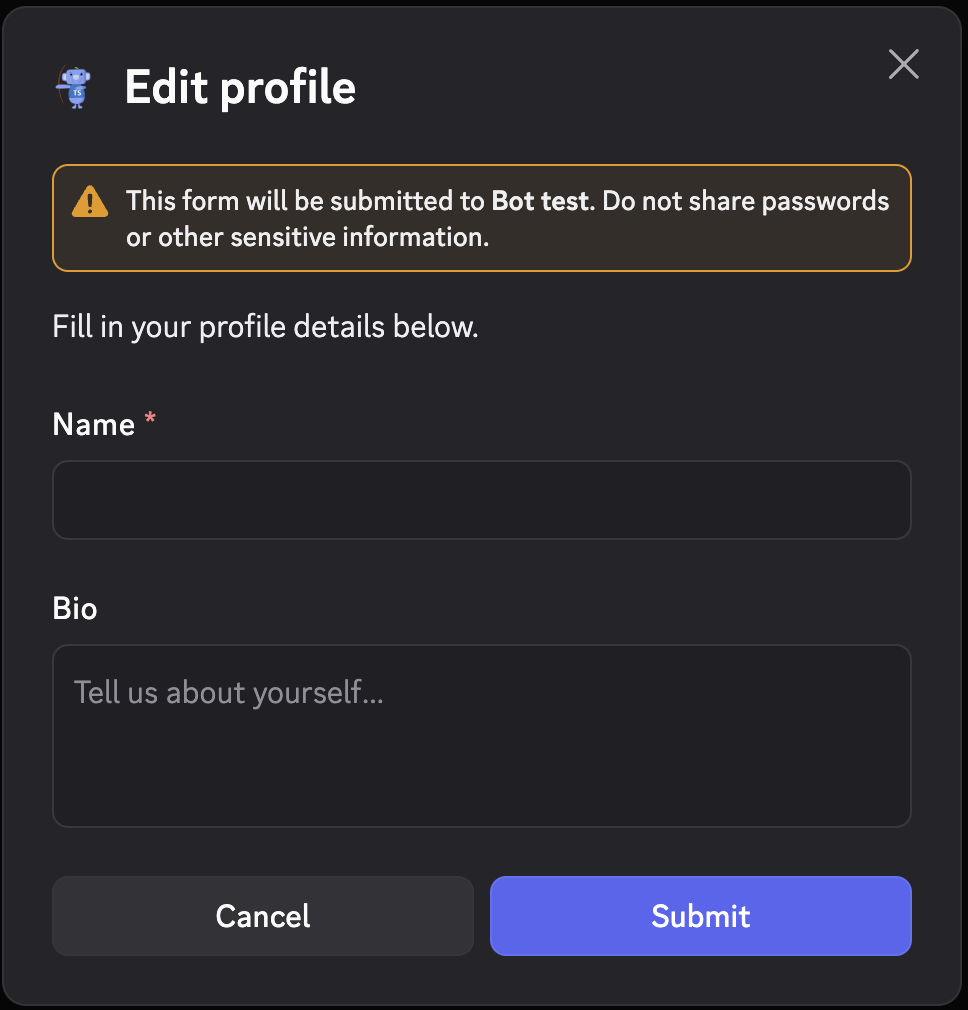
export const profileModal = createModal({
route: "modal/profile",
fields: {
name: modalTextInput({ label: "Name", required: true, maxLength: 80 }),
bio: modalTextInput({ label: "Bio", style: "paragraph", required: false }),
},
build: (id, fields) => buildModal({
title: "Edit profile",
customId: id(),
components: [
"Fill in your profile details below.", // equivalent to text()
fields.name.label(),
fields.bio.label(),
],
}),
run: (ctx) => {
const name: string = ctx.values.name;
const bio: string | undefined = ctx.values.bio;
return ctx.reply(`Name: ${name}, bio: ${bio ?? "—"}`);
},
});
Trigger it from a command or button:
ctx.showModal(profileModal.build());
Text input
modalTextInput creates a standard text field.
modalTextInput({
  label: "Title",
  style: "short",         // "short" (default) or "paragraph" (multi-line)
  required: true,
  placeholder: "Enter a title…",
  minLength: 3,
  maxLength: 100,
})
ctx.values.fieldName is string when required, string | undefined when optional.
Select fields inside a modal
Discord's interactive modal components let you embed select menus directly in modals.
String select
import { buildModal, createModal, modalStringSelect } from "arcscord";
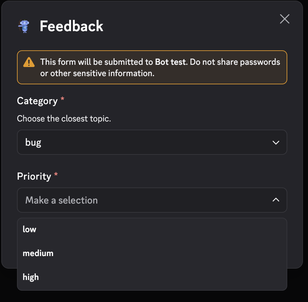
export const feedbackModal = createModal({
route: "modal/feedback",
fields: {
category: modalStringSelect({
label: "Category",
description: "Choose the closest topic.",
options: ["bug", "idea", "question"],
required: true,
}),
priority: modalStringSelect({
label: "Priority",
options: ["low", "medium", "high"],
required: true,
}),
},
build: (id, fields) => buildModal({
title: "Feedback",
customId: id(),
components: [fields.category.label(), fields.priority.label()],
}),
run: (ctx) => {
const category: "bug" | "idea" | "question" = ctx.values.category;
const priority: "low" | "medium" | "high" = ctx.values.priority;
return ctx.reply(`${category} — ${priority}`);
},
});
ctx.values.category is typed as the union of the option values.
Radio group
Use modalRadioGroup for single-choice selection displayed as radio buttons:
import { modalRadioGroup } from "arcscord";

fields: {
  mood: modalRadioGroup({
    label: "Mood",
    required: true,
    options: [
      { label: "Great", value: "great" },
      { label: "Okay", value: "okay" },
      { label: "Blocked", value: "blocked" },
    ],
  }),
}
ctx.values.mood is typed as "great" | "okay" | "blocked".
Checkbox group
modalCheckboxGroup allows multiple selections:
import { modalCheckboxGroup } from "arcscord";

fields: {
  features: modalCheckboxGroup({
    label: "Features used",
    description: "Pick every component family you tested.",
    required: false,
    minValues: 0,
    maxValues: 3,
    options: [
      { label: "Commands", value: "commands" },
      { label: "Components", value: "components" },
      { label: "Events", value: "events" },
    ],
  }),
}
ctx.values.features is typed as Array<"commands" | "components" | "events">.
Single checkbox
modalCheckbox renders a single on/off toggle:
import { modalCheckbox } from "arcscord";

fields: {
  subscribe: modalCheckbox({
    label: "Subscribe to updates",
    default: false,
  }),
}
ctx.values.subscribe is boolean.
Combined example — survey modal
import {
buildModal, createModal,
modalCheckbox, modalCheckboxGroup, modalRadioGroup,
} from "arcscord";
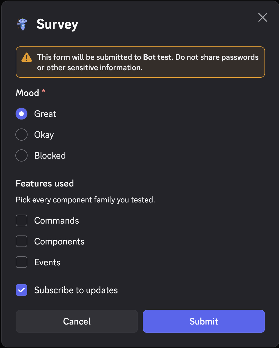
export const surveyModal = createModal({
route: "modal/survey",
fields: {
mood: modalRadioGroup({
label: "Mood",
required: true,
options: [
{ label: "Great", value: "great" },
{ label: "Okay", value: "okay" },
{ label: "Blocked", value: "blocked" },
],
}),
features: modalCheckboxGroup({
label: "Features used",
description: "Pick every component family you tested.",
required: false,
minValues: 0,
maxValues: 3,
options: [
{ label: "Commands", value: "commands" },
{ label: "Components", value: "components" },
{ label: "Events", value: "events" },
],
}),
subscribe: modalCheckbox({ label: "Subscribe to updates", default: true }),
},
build: (id, fields) => buildModal({
title: "Survey",
customId: id(),
components: [fields.mood.label(), fields.features.label(), fields.subscribe.label()],
}),
run: (ctx) => {
const mood: "great" | "okay" | "blocked" = ctx.values.mood;
const features: Array<"commands" | "components" | "events"> = ctx.values.features;
return ctx.reply(`Mood: ${mood}, features: ${features.join(", ")}, subscribe: ${ctx.values.subscribe}`);
},
});
Entity select fields
Modals can include user, role, mentionable, and channel selects:
import {
buildModal, createModal,
modalMentionableSelect, modalRoleSelect, modalUserSelect,
} from "arcscord";
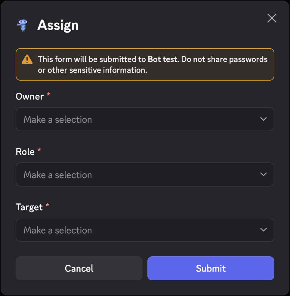
export const assignModal = createModal({
route: "modal/assign",
fields: {
owner: modalUserSelect({ label: "Owner", required: true }),
role: modalRoleSelect({ label: "Role", required: true }),
target: modalMentionableSelect({ label: "Target", required: true }),
},
build: (id, fields) => buildModal({
title: "Assign",
customId: id(),
components: [fields.owner.label(), fields.role.label(), fields.target.label()],
}),
run: (ctx) => {
return ctx.reply(
`Owner: ${ctx.values.owner.username}, role: ${ctx.values.role.name}`,
);
},
});
| Helper | ctx.values type |
|---|---|
modalUserSelect | User / User | undefined |
modalRoleSelect | Role / Role | undefined |
modalMentionableSelect | User | Role |
modalChannelSelect | Channel |
modalUserSelect with maxValues > 1 produces User[].
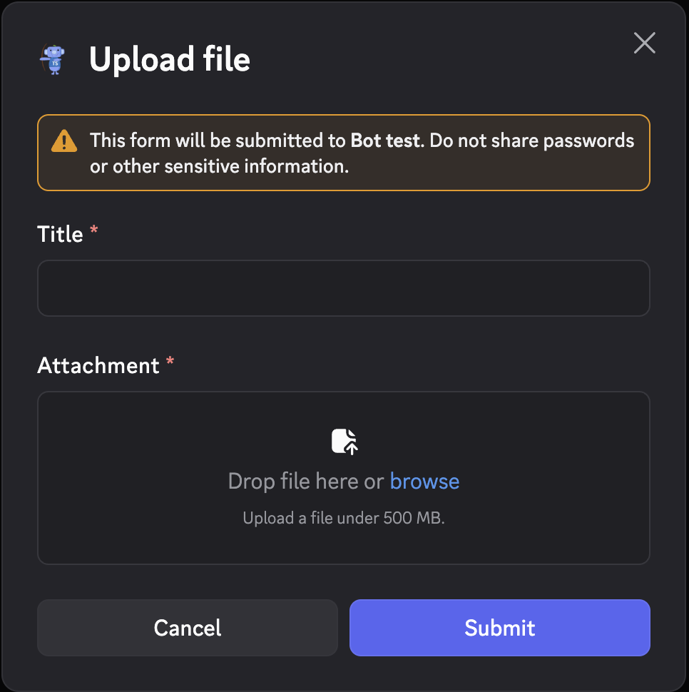
File upload
modalFileUpload lets users attach a file:
import { buildModal, createModal, modalFileUpload, modalTextInput } from "arcscord";

export const uploadModal = createModal({
  route: "modal/upload",
  fields: {
    title: modalTextInput({ label: "Title", required: true }),
    attachment: modalFileUpload({
      label: "Attachment",
      required: true,
      minValues: 1,
      maxValues: 1,
    }),
  },
  build: (id, fields) => buildModal({
    title: "Upload file",
    customId: id(),
    components: [fields.title.label(), fields.attachment.label()],
  }),
  run: (ctx) => {
    return ctx.reply(
      `Title: ${ctx.values.title}, file: ${ctx.values.attachment.name}`,
    );
  },
});
ctx.values.attachment is an Attachment object with .name, .url, .size, etc.
Adding text between fields
Use text() to add explanatory content between form fields:
import { text } from "arcscord";

build: (id, fields) => buildModal({
  title: "Feedback",
  customId: id(),
  components: [
    text("Use the fields below to send structured feedback."),
    fields.category.label(),
    fields.message.label(),
  ],
})