Components v2
Components v2 is Discord's layout-first message format. A v2 message is built entirely from layout and media components instead of content + embeds. Arcscord sets the required IS_COMPONENTS_V2 flag automatically.
v2Message()
Entry point for a v2 message. Wraps layout components and optional message-level options.
import { v2Message } from "arcscord";

ctx.reply(v2Message(
  "Hello from Components v2!", // plain string — equivalent to text()
));
Message-level options
Pass an options object as the first argument (before layout children) to set message-level flags:
import { MessageFlags } from "discord.js";

ctx.reply(v2Message(
  { files: [{ attachment: buffer, name: "output.txt" }], flags: MessageFlags.Ephemeral },
  "See the attached file.",
))
| Option | Type | Description |
|---|---|---|
files | AttachmentData[] | File attachments. Reference them in file() via attachment://filename. |
flags | MessageFlags | Message flags. Use MessageFlags.Ephemeral to make the message visible only to the user who triggered it. IS_COMPONENTS_V2 is always added automatically. |
tts | boolean | Text-to-speech. |
allowedMentions | AllowedMentions | Control which mentions trigger notifications. |
Allowed top-level children
v2Message and container() accept these component types as children:
| Type | Description |
|---|---|
string / text() | Text display block. A plain string is always equivalent to text(). |
container() | Styled group of components |
section() | Text + accessory side by side |
separator() | Vertical spacing / divider |
mediaGallery() | Image grid |
file() | Uploaded file display |
actionRow(button1, button2, ...) | Row of up to 5 buttons (buttons only) |
arcscord select menu ActionRowData | The return value of stringSelectMenu(), userSelectMenu(), etc. — they already include their own action row |
text(content, options?)
Renders a block of Markdown text. A plain string is accepted everywhere text() is — they are fully equivalent.
text("## Title\nBody paragraph with **bold** and `code`.")
"## Title\nBody paragraph with **bold** and `code`." // same result
| Option | Type | Required | Description |
|---|---|---|---|
content | string | Yes | Markdown content. Supports Discord's Markdown subset. |
id | number | No | Internal component ID. Only needed when targeting a specific component in a later edit. |
separator(options?)
Adds vertical space between components. Can optionally render a visible horizontal line.
separator({ divider: true, spacing: "large" })
separator({ spacing: "small" })
separator() // default: no divider, small spacing
| Option | Type | Default | Description |
|---|---|---|---|
divider | boolean | false | Render a visible horizontal rule. |
spacing | "small" | "large" | "small" | Vertical gap size. |
id | number | — | Internal component ID. |
section(options?, ...content, accessory)
Places text content on the left and one accessory (a thumbnail or a button) on the right.
import { section, accessory, thumbnail } from "arcscord";

section(
  "Text content goes here.",
  "A second paragraph.",
  accessory(thumbnail({ media: { url: "https://example.com/img.png" } })),
)
With explicit options:
section(
  { id: 1 },
  "Support ticket",
  "Click the button to open a ticket.",
  accessory(openButton.build()),
)
Section options (first argument, optional)
| Option | Type | Description |
|---|---|---|
id | number | Internal component ID. |
Content arguments
Pass any number of text items before the accessory — strings are automatically wrapped in text().
Accessory (last argument, required)
Must be accessory(thumbnail(...)) or accessory(button(...)). Only one accessory per section.
accessory(component)
Wraps a thumbnail or button to mark it as a section accessory.
accessory(thumbnail({ media: { url: "..." }, description: "Alt text" }))
accessory(myButton.build())
| Accepted value | Description |
|---|---|
thumbnail(...) | An image displayed to the right of the section text. |
button(...) | An interactive button displayed to the right. |
thumbnail(options)
An image component used exclusively as a section accessory.
thumbnail({
  media: { url: "https://cdn.discordapp.com/embed/avatars/0.png" },
  description: "Default avatar",
  spoiler: false,
})
| Option | Type | Required | Description |
|---|---|---|---|
media | { url: string } | Yes | URL of the image. Can be an attachment:// URL or an external URL. |
description | string | No | Alt text for accessibility. Max 1024 chars. |
spoiler | boolean | No | Blurs the image until clicked. Default: false. |
id | number | No | Internal component ID. |
container(options?, ...children)
Groups components into a visual box with an optional coloured left border.
import { container } from "arcscord";

container(
  { accentColor: 0x5865F2 },
  text("Inside the container."),
  separator({ divider: true }),
  actionRow(myButton.build()),
)
Container options (first argument, optional)
| Option | Type | Description |
|---|---|---|
accentColor | number | null | RGB colour for the left border accent, as a decimal integer (e.g. 0x5865F2). null removes the accent. |
spoiler | boolean | Blurs all content inside the container until clicked. Default: false. |
id | number | Internal component ID. |
Allowed children
| Type | Notes |
|---|---|
string / text() | Rendered as a text display block |
section() | Text + accessory |
separator() | Spacing / divider |
mediaGallery() | Image grid |
file() | Uploaded file |
actionRow() | Interactive buttons |
section() and mediaGallery() cannot be nested inside each other inside a container.
mediaGallery(options)
Displays a grid of images (1–10 items).
import { mediaGallery } from "arcscord";

mediaGallery({
  items: [
    { media: { url: "https://cdn.discordapp.com/embed/avatars/0.png" }, description: "Image 1" },
    { media: { url: "https://cdn.discordapp.com/embed/avatars/1.png" }, description: "Image 2", spoiler: true },
  ],
})
| Option | Type | Required | Description |
|---|---|---|---|
items | MediaGalleryItem[] | Yes | 1 to 10 images. |
id | number | No | Internal component ID. |
Each MediaGalleryItem:
| Field | Type | Required | Description |
|---|---|---|---|
media | { url: string } | Yes | Image URL. External URLs or attachment:// references. |
description | string | No | Alt text. Max 1024 chars. |
spoiler | boolean | No | Blurs the image. Default: false. |
file(options)
Renders a file that was uploaded with the message.
import { file } from "arcscord";
import { Buffer } from "node:buffer";

ctx.reply(v2Message(
  { files: [{ attachment: Buffer.from("hello\n"), name: "output.txt" }] },
  file({ file: { url: "attachment://output.txt" } }),
))
| Option | Type | Required | Description |
|---|---|---|---|
file | { url: string } | Yes | Must be { url: "attachment://filename" } referencing a file uploaded in the message options. |
spoiler | boolean | No | Blurs the file preview. Default: false. |
id | number | No | Internal component ID. |
actionRow(...buttons)
A row of up to 5 buttons. Used for interactive buttons inside v2 messages.
import { actionRow } from "arcscord";

actionRow(confirmButton.build(), cancelButton.build())
actionRow only accepts buttons. Select menus built with arcscord helpers (stringSelectMenu(), userSelectMenu(), etc.) already return an ActionRowData — pass their result directly to v2Message() or container() without wrapping:
import { stringSelectMenu, userSelectMenu } from "arcscord";

ctx.reply(v2Message(
  "Pick a value",
  stringSelectMenu({ customId: "...", options: ["a", "b"] }),
  "Pick a user",
  userSelectMenu({ customId: "..." }),
  actionRow(confirmButton.build()),
))
Nesting rules
| Parent | Allowed children |
|---|---|
v2Message() / container() | string / text(), section(), separator(), mediaGallery(), file(), actionRow() (buttons), select menu ActionRowData |
section() | Text strings / text() + exactly one accessory() |
accessory() | thumbnail() or a single button() |
actionRow() | Up to 5 buttons only |
Examples
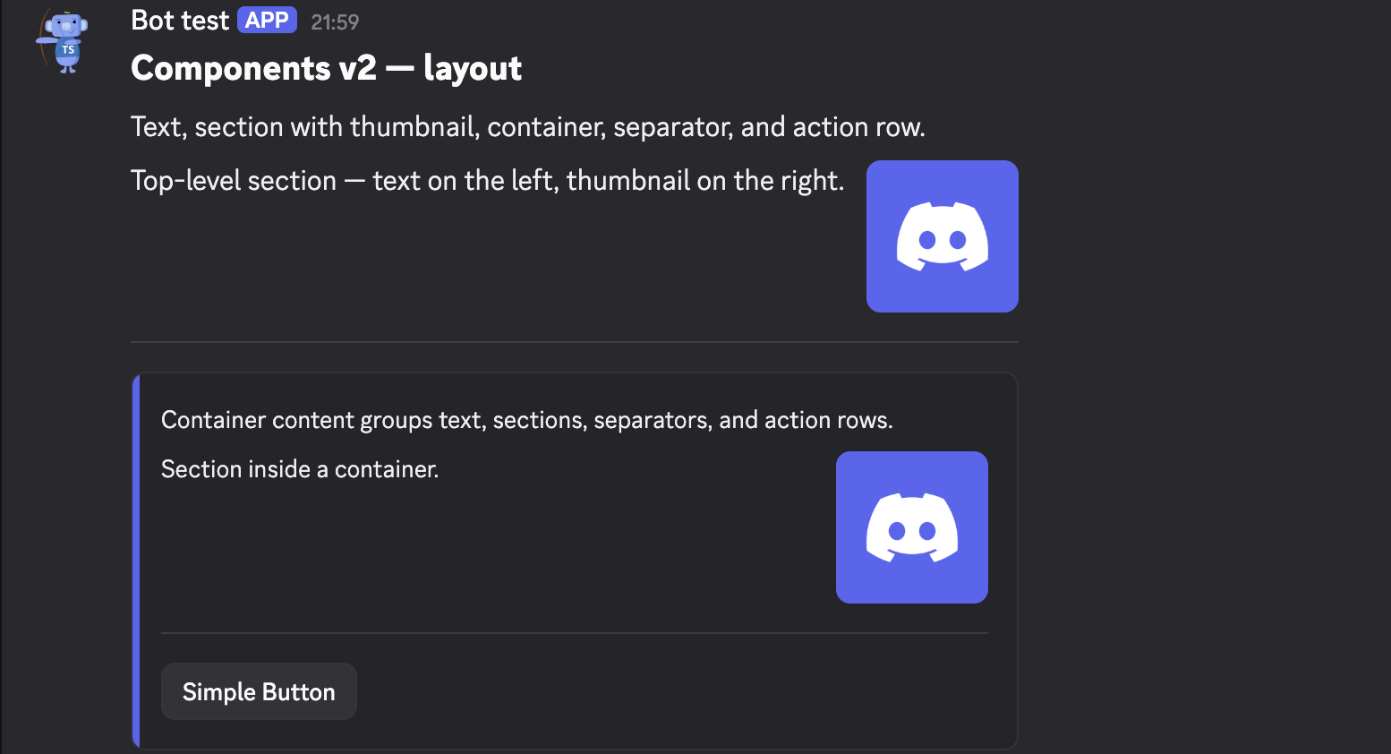
Layout — text, section, container, separator
ctx.reply(
  v2Message(
    text("## Components v2 — layout\nText, section with thumbnail, container, separator, and action row."),
    section(
      "Top-level section — text on the left, thumbnail on the right.",
      accessory(thumbnail({
        media: { url: "https://cdn.discordapp.com/embed/avatars/0.png" },
        description: "Default avatar",
      })),
    ),
    separator({ divider: true, spacing: "large" }),
    container(
      { accentColor: 0x5865F2 },
      "Container content groups text, sections, separators, and action rows.",
      section(
        "Section inside a container.",
        accessory(thumbnail({
          media: { url: "https://cdn.discordapp.com/embed/avatars/0.png" },
          description: "Avatar",
        })),
      ),
      separator({ divider: true, spacing: "large" }),
      actionRow(simpleButton.build()),
    ),
  ),
)
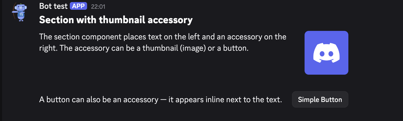
Section — thumbnail and button as accessory
ctx.reply(
  v2Message(
    text("## Section with thumbnail accessory"),
    section(
      { id: 1 },
      "The section component places text on the left and an accessory on the right. The accessory can be a thumbnail (image) or a button.",
      accessory(thumbnail({
        media: { url: "https://cdn.discordapp.com/embed/avatars/0.png" },
        description: "Thumbnail accessory",
      })),
    ),
    separator({ divider: false, spacing: "large" }),
    section(
      { id: 2 },
      "A button can also be an accessory — it appears inline next to the text.",
      accessory(simpleButton.build()),
    ),
  ),
)
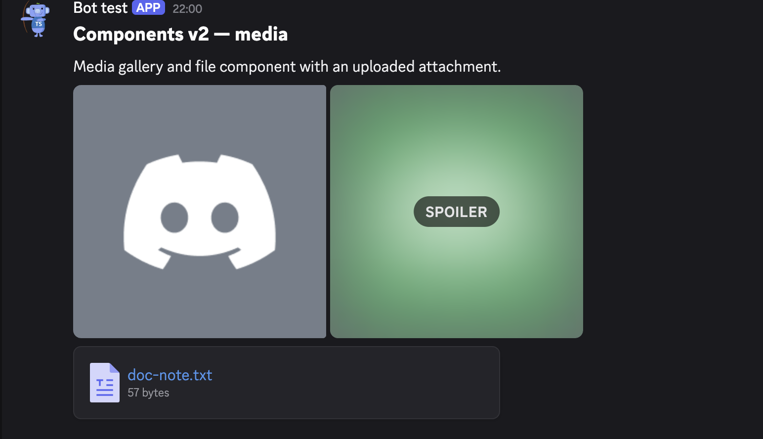
Media — gallery and file
ctx.reply(v2Message(
  {
    files: [{
      attachment: Buffer.from("This file is rendered by a Components v2 File component.\n"),
      name: "doc-note.txt",
    }],
  },
  text("## Components v2 — media\nMedia gallery and file component with an uploaded attachment."),
  mediaGallery({
    items: [
      { media: { url: "https://cdn.discordapp.com/embed/avatars/1.png" }, description: "Gallery image 1" },
      { media: { url: "https://cdn.discordapp.com/embed/avatars/2.png" }, description: "Gallery image 2 (spoiler)", spoiler: true },
    ],
  }),
  file({ file: { url: "attachment://doc-note.txt" } }),
))
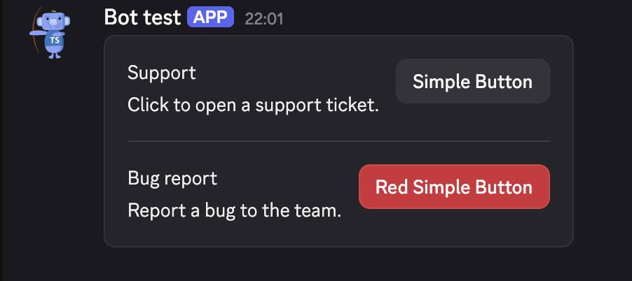
Practical — support panel
ctx.reply(
  v2Message(
    container(
      section(
        "Support",
        "Click to open a support ticket.",
        accessory(openTicketButton.build()),
      ),
      separator({ spacing: "large" }),
      section(
        "Bug report",
        "Report a bug to the team.",
        accessory(bugButton.build()),
      ),
    ),
  ),
)
Full example
import { Buffer } from "node:buffer";
import {
  accessory, actionRow, container, file,
  mediaGallery, section, separator, text, thumbnail, v2Message,
} from "arcscord";

ctx.reply(v2Message(
  {
    files: [{ attachment: Buffer.from("Report data\n"), name: "report.txt" }],
  },
  text("## Weekly report"),
  section(
    "Stats for this week are ready.",
    accessory(thumbnail({
      media: { url: "https://cdn.discordapp.com/embed/avatars/0.png" },
      description: "Report icon",
    })),
  ),
  separator({ divider: true, spacing: "large" }),
  container(
    { accentColor: 0x57F287 },
    text("**Charts**"),
    mediaGallery({
      items: [
        { media: { url: "https://cdn.discordapp.com/embed/avatars/1.png" }, description: "Chart A" },
        { media: { url: "https://cdn.discordapp.com/embed/avatars/2.png" }, description: "Chart B" },
      ],
    }),
    separator({ divider: false, spacing: "small" }),
    text("**Raw data**"),
    file({ file: { url: "attachment://report.txt" } }),
    separator({ divider: true }),
    actionRow(downloadButton.build()),
  ),
))